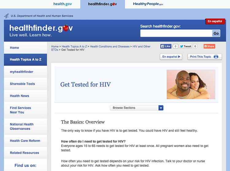
3.5 Keep the most important content above the fold—even on mobile.24,30,61
Users spend the most time looking at content they see first,62 so make sure the most important and compelling content appears above the fold. Users also judge the content they can see to decide whether it’s worth scrolling down to see more.62
The most important content in this topic about getting tested for HIV is visible above the fold.

Source: https://health.gov/myhealthfinder/topics/health-conditions/hiv-other-stds/get-tested-hiv
Keep in mind that low literacy readers may have trouble with scrolling—eye-tracking data shows that the need to scroll makes it more likely that they’ll skip content as they try to find their place again to continue reading. That’s why it’s important to minimize scrolling when you can.63
If your content continues below the fold, the best cue to let users know they need to scroll down is a paragraph of text that crosses the scroll line.64 However, it’s very challenging to ensure that this will display consistently on different screen sizes—so you may want to consider using a scroll arrow or scroll bar instead.65
View your website using different monitors, browsers, and devices to see how your content displays on the screen.
Finally, be aware that users may mistake horizontal lines or large sections of white space at the bottom of their screen for the end of a webpage. That’s a good reason to look at your site on many devices and screen sizes. If you find either of these at the bottom of a page, consider making some changes—“false bottoms” might stop people from seeing all of your content.24