3.7 Use color or underline to identify links.
Display links so users will easily recognize them as clickable—and stay consistent with presentation throughout your site.66
To follow established guidelines for displaying links:
- Use blue for unvisited links and purple for visited links unless you have a reason to choose different colors.
- Test your color choice to make sure it stands out from the body text—and that it’s visible to people who are color blind.50
- Underline links in main content areas—users still recognize underlined content as a hyperlink indicator (especially users with low vision or other accessibility issues).67
- Don’t underline items like navigation menus if their location makes it clear that they’re links.50
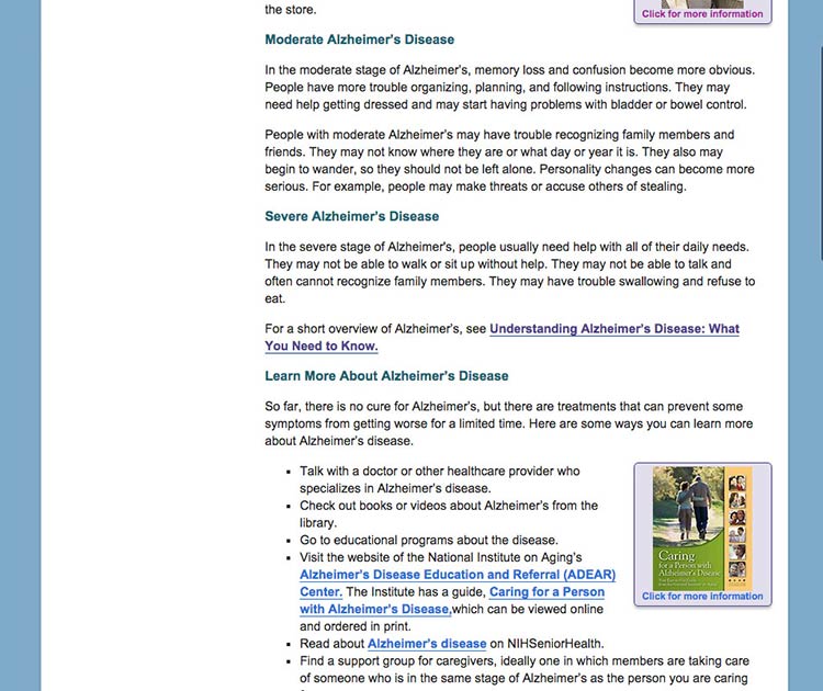
Figure 3.8

NIH Senior Health uses standard link guidelines—blue and underlined for unvisited links, and purple for visited links.

Source: http://nihseniorhealth.gov/alzheimerscare/afterthediagnosis/01.html