1. What We Know About Users with Limited Literacy Skills
Introduction
There’s a growing body of literature related to the cognitive processing
and online behavior of adults with limited literacy skills. In this
section, we outline what we know about how literacy can affect a user’s
ability to read, process information on a screen of any size, and
interact with technology.
The bottom line: Literacy skills can impact virtually every aspect of
using the web.
1.1 Reading and cognitive processing challenges
Cognitively speaking, reading is a lot of work—it involves both decoding
and understanding text. First, a user has to “decode” the text by
assigning meaning to the words. Next, a user has to comprehend the text
by stringing the words together to understand what the author is trying
to communicate in a particular sentence or
paragraph.1,2,3
Users with limited literacy skills have more problems with short-term
and working memory than users with higher literacy
skills.4 They may struggle to decode challenging words
and remember their meanings.3 If a webpage has a large
amount of content, users may not be able to remember it all.
Furthermore, what they do remember may not be the most important
information.
Users with limited literacy skills often describe themselves as reading
well or very well.3,5 However, data from
eye-tracking and usability studies paint a different picture.
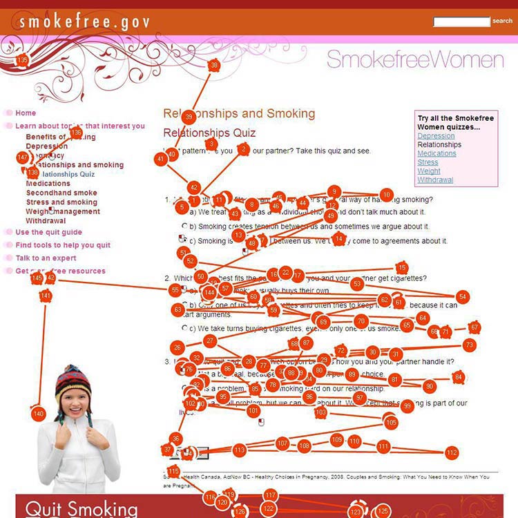
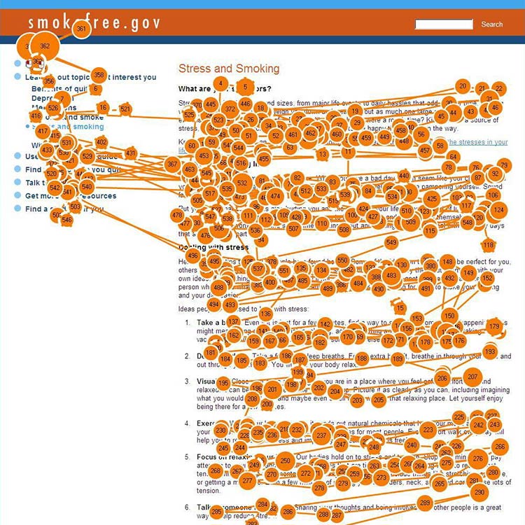
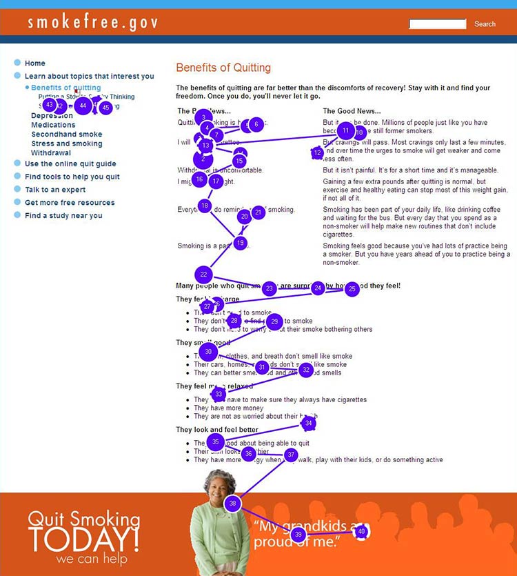
According to these studies, users with limited literacy skills generally
read more slowly, and reread words, sections, or elements on a website
(like buttons or menus) in order to understand them.3
And depending on the situation, limited-literacy users may:
- Skip words or sections, or start reading in the middle of a
paragraph3,7,8,9
- Try to read every word because they can’t effectively scan and draw
meaning from
content3,7,10—this is
more common when users are reading something very important and they
feel the stakes are high
These strategies used by users with limited literacy skills reinforce
the importance of creating simple content that won’t overwhelm readers
with too many words. Dense “walls of words” can trigger limited-literacy
readers to skip content altogether—or they may try to read every word on
the page while struggling to understand what they’re reading.
Additionally, online forms present a unique set of challenges for
limited-literacy users. Users need to read the instructions and the form
field labels, and then either spell the answers to questions or read and
select from multiple-choice answers.3 This is a lot to
ask from users with limited literacy skills.
Figure 1.1
Gaze path of a reader who does not have limited literacy skills skimming a page.

Figure 1.2
Gaze path of a user who has limited literacy skills reading (and re-reading) every word.

Figure 1.3
Gaze path of a user with limited literacy skills reading only the text that looks easy to read.

1.2 Understanding navigation
When navigating a website, users with limited literacy skills tend to:
- Get distracted by extra words and elements of a website (like links
and icons)3,11
- Navigate in a linear fashion and backtrack
frequently4,10
- Choose the first answer they find, without checking if it’s
correct—and have a hard time telling the difference between high-
and low-quality
information3,10,12
- Have trouble recovering from mistakes10
When reading, users with limited literacy skills focus on the center of
the screen. Once they shift their focus from the navigation to the
center of the screen, they’re unlikely to look back to the navigation to
solve a problem or change course if the content isn’t meeting their
needs.10,13
1.3 Using search
Using a website search function can be challenging for people with
limited literacy skills. Typing in a search term requires (somewhat)
accurate spelling—and some search engines help with spelling better than
others. Reading and comparing search results to identify the best option
is a cognitively challenging task.
As a result, compared with users with advanced literacy skills, users
with limited literacy skills:
- Spend more time on information search
tasks3,10
- Are more likely to give up if they can’t find information
quickly10
- Have a hard time thinking of search terms14
- Tend to only click 1 or 2 links in the search
result14
- Add terms to refine a search instead of changing their search
strategy15
The ways people with limited literacy skills tried to find information
differ from user to user.10
Example
In previous healthfinder.gov usability testing, the team observed 5
users while they searched for information in 5 completely different
ways. Some used the left navigation menu, while others used the homepage
buttons or the search bar.
1.4 Mobile considerations
Users with limited literacy skills are likely to access the web on
mobile devices—more than 90% own a mobile phone.16 We
also know that users with lower incomes, users with less education, and
minority users are especially likely to access the internet primarily
from their mobile phones.17
Research shows that people with limited literacy skills find it easier
to learn how to use mobile devices than desktop
computers.18
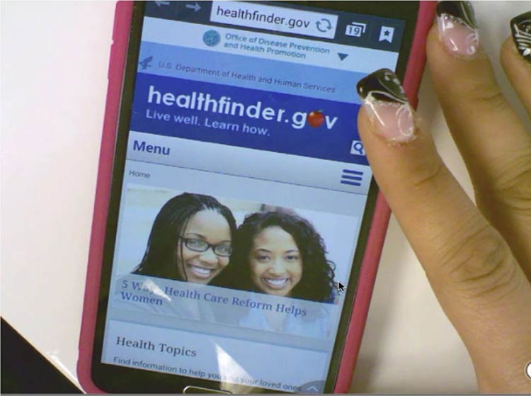
Figure 1.4
When we tested healthfinder.gov on mobile in March 2015, users navigated through health topics much more easily on their mobile devices than on a desktop computer.

Additionally, mobile screens can make reading easier for users with
reading disabilities. For this population, both speed and comprehension
may improve when reading on a mobile screen. Studies suggest this may be
because of line length—lines on mobile devices are inherently
short.19
All of the best practices set forth in this guide enhance mobile
usability. However, there are some specific considerations to take into
account when designing online health information for mobile devices.
Challenges of mobile display
Because we know that so many users with limited literacy skills are
accessing information on mobile devices, it’s very important to consider
the challenges presented by mobile display.
In spite of the fact that many users with limited literacy skills may
ultimately find mobile easier to use than desktop computers, they still
struggle with elements of navigation on mobile devices, like:
- Following hierarchical navigation
- Knowing where to look for information
- Using scroll bars within menus
- Using a single button (like the iPhone menu button) for a variety of
different purposes depending on context
- Using a small keyboard to enter text20
In general, mobile content can be twice as difficult for all users to
digest.21 Part of this is because it’s harder to
understand complicated information when you’re reading on a tiny screen,
like an iPhone.21
Additionally, mobile device users are constantly scrolling because they
can’t see all the information on the page at once. That means users are
moving around the page to refer to other parts of the content instead of
simply glancing at it as they might on a desktop screen. This can
negatively affect users’ understanding.22 The constant
need for scrolling:
- Takes more time
- Diverts users’ attention
- Introduces the problem of reorienting position on the
page22
Summary
It’s critical that we understand and anticipate the online behavior of
users with limited literacy skills—including what kind of devices
they’re using to view web content. Even users with high literacy skills
may find reading and using the web more difficult when they are sick,
stressed, or tired. Designing websites with these behaviors in mind will
make the web a better place for all of us.23
On the journey to better user experience, simplifying content is a
logical place to start.
In the next section, we cover the basics of writing actionable, engaging
plain language content for the web.
