1.4 Mobile considerations
Users with limited literacy skills are likely to access the web on mobile devices—more than 90% own a mobile phone.16 We also know that users with lower incomes, users with less education, and minority users are especially likely to access the internet primarily from their mobile phones.17
Research shows that people with limited literacy skills find it easier to learn how to use mobile devices than desktop computers.18
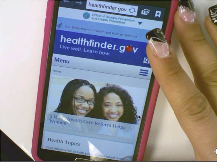
When we tested healthfinder.gov on mobile in March 2015, users navigated through health topics much more easily on their mobile devices than on a desktop computer.

Source: healthfinder.gov mobile usability testing
Additionally, mobile screens can make reading easier for users with reading disabilities. For this population, both speed and comprehension may improve when reading on a mobile screen. Studies suggest this may be because of line length—lines on mobile devices are inherently short.19
All of the best practices set forth in this guide enhance mobile usability. However, there are some specific considerations to take into account when designing online health information for mobile devices.
Challenges of mobile display
Because we know that so many users with limited literacy skills are accessing information on mobile devices, it’s very important to consider the challenges presented by mobile display.
In spite of the fact that many users with limited literacy skills may ultimately find mobile easier to use than desktop computers, they still struggle with elements of navigation on mobile devices, like:
- Following hierarchical navigation
- Knowing where to look for information
- Using scroll bars within menus
- Using a single button (like the iPhone menu button) for a variety of different purposes depending on context
- Using a small keyboard to enter text20
In general, mobile content can be twice as difficult for all users to digest.21 Part of this is because it’s harder to understand complicated information when you’re reading on a tiny screen, like an iPhone.21
Additionally, mobile device users are constantly scrolling because they can’t see all the information on the page at once. That means users are moving around the page to refer to other parts of the content instead of simply glancing at it as they might on a desktop screen. This can negatively affect users’ understanding.22 The constant need for scrolling:
- Takes more time
- Diverts users’ attention
- Introduces the problem of reorienting position on the page22